• blog design
maecapozzi.com
ABOUT
Mae Capozzi is a software engineer who has spent the last decade working on and writing about design systems, frontend infrastructure, and developer experience. As she became more prolific, she needed a blog with better functionality.
ROLE
Lead Product Designer
TOOLS
Figma, Cursor AI
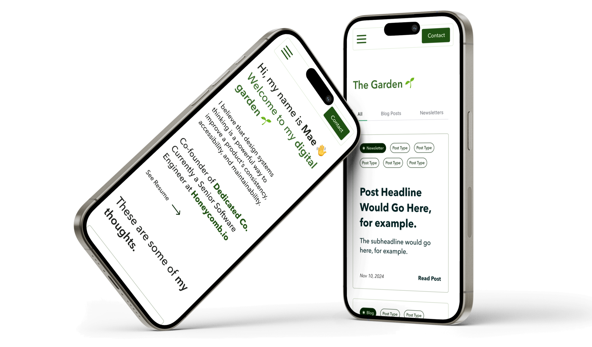
Table of Contents —
I. Discover.
What were we aiming to understand?
research goals
I wanted to know what types of posts the blog would host, what the client’s aims were for users once they on the site, and for what business purposes the client.
findings
Client Intake Findings
What purpose will this serve?
The blog should include long form posts about the client’s areas of expertise. It should also serve as an archive for past newsletters.
Who is your intended user for the feature?
Frontend developers, project managers, product managers, and anyone interested in UX/UI.
What are your goals for this blog?
The client wanted to her audience, keep them engaged, and educate them on her areas of expertise. It should drive newsletter sign-ups and future work/collaboration.
How would you like the blog to look?
The design of should sparse, straightforward with recognizable design patterns and interactions. It should maintain the minimalistic elements of the original blog, but in a way that is more engaging for users.
Competitor Research Findings
When I asked the client to share some blogs she found successful, most of them had a personable tone while exhibiting a high level of subject matter expertise. Storytelling and accessible language are important to her. So while establishing herself as an expert in certain niches the objective, remaining approachable to tangential disciplines (project managers, designers, etc.) would be crucial to the presentation of information.
II. Define.
How should we solve the problem?
product roadmap
Blog Features and Constraints
What features do users need to ensure the product functions? What can I add to make the product more enjoyable? The priority features were validated by stakeholder goals and market research.
Priority Features
Top navigation: home, about, posts, contact pages
Homepage: Hero section with introduction, featured posts
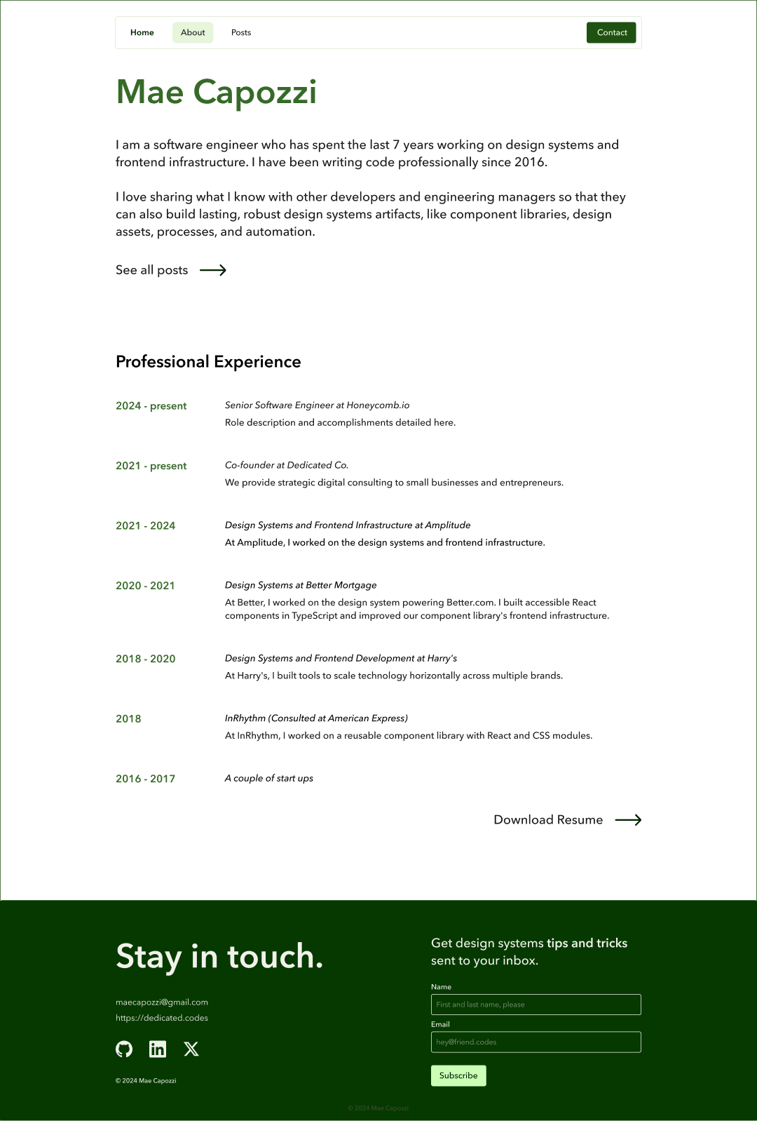
About page: client’s current and prior frontend development experience
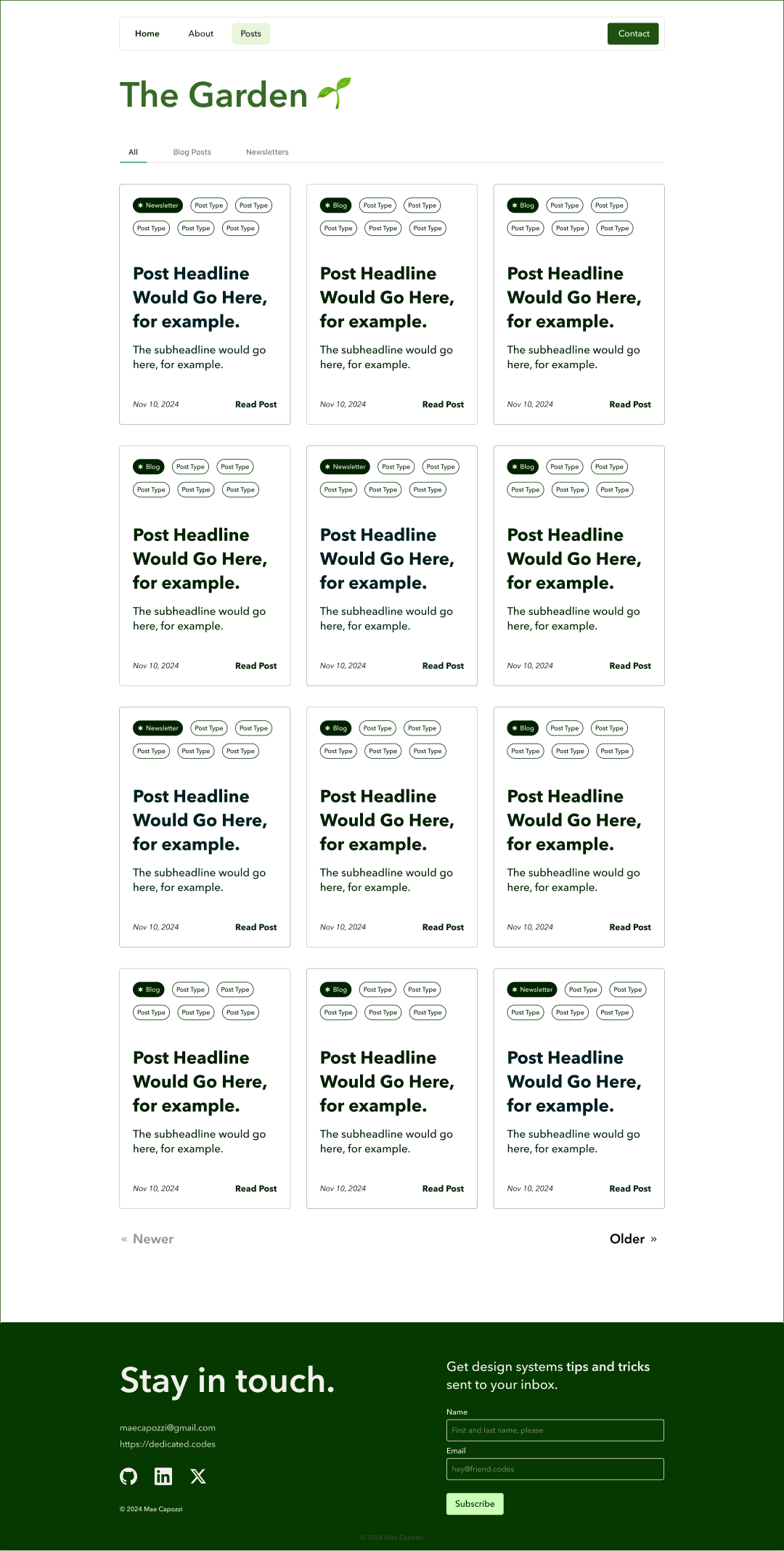
Posts: blog and newsletter posts, tab filtering options, pagination
Contact: CTA that says contact with a tooltip that says “copy email”
Footer: Newsletter sign-up, contact information, relevant off-site navigation links.
Constraints
Designing for Cursor AI: The client wanted to test using Cursor to see how it improved her component build speed.
No header images: Images often help break up text and add context to cards/headers. However, the client did not want to spend time sourcing these images.
III. Design.
What should it look like and how should users interact with it?
starting point
Original Blog
The previous version of Mae’s blog (pictured below) served more as a resume with a list of links rather than a blog. Some of the UX/UI issues included unclear navigation beyond the top nav, detours throughout the user journey, no footer for on and off-site engagement, no contact information, endless scroll on some pages, and newsletter sign-up hidden within posts.
designs
A Brand New Garden
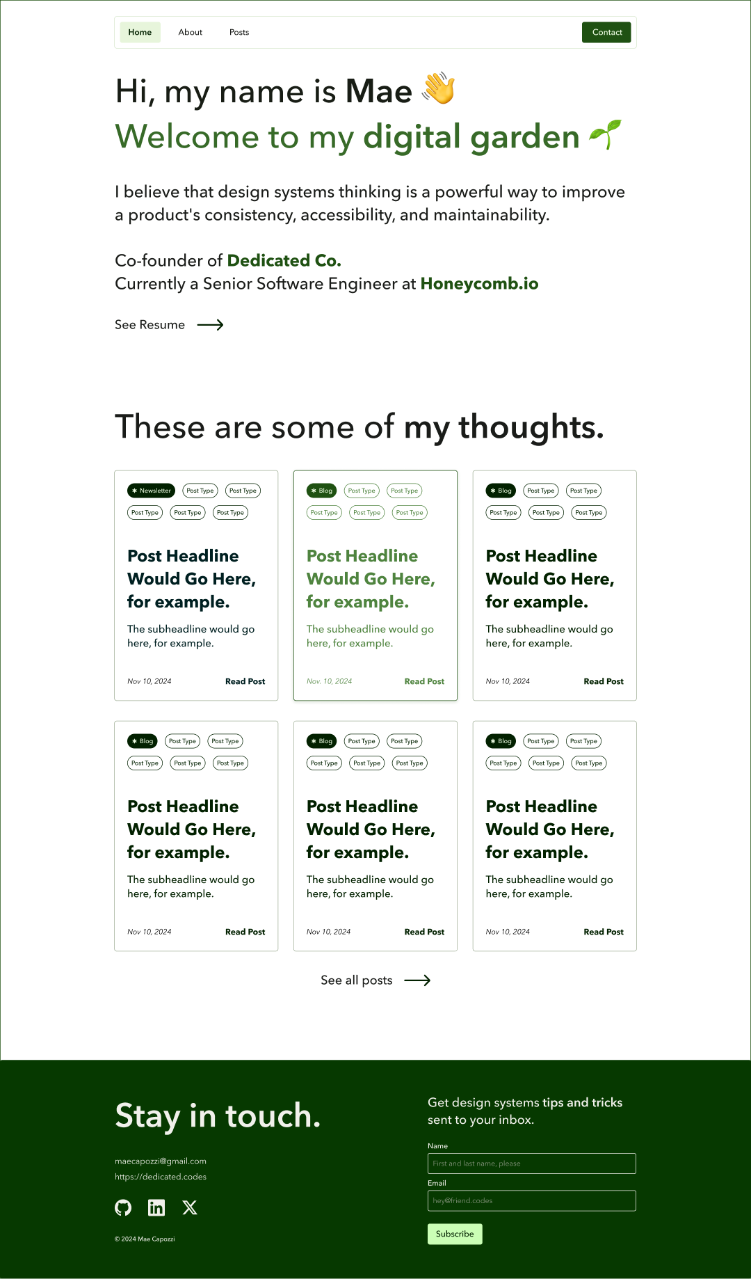
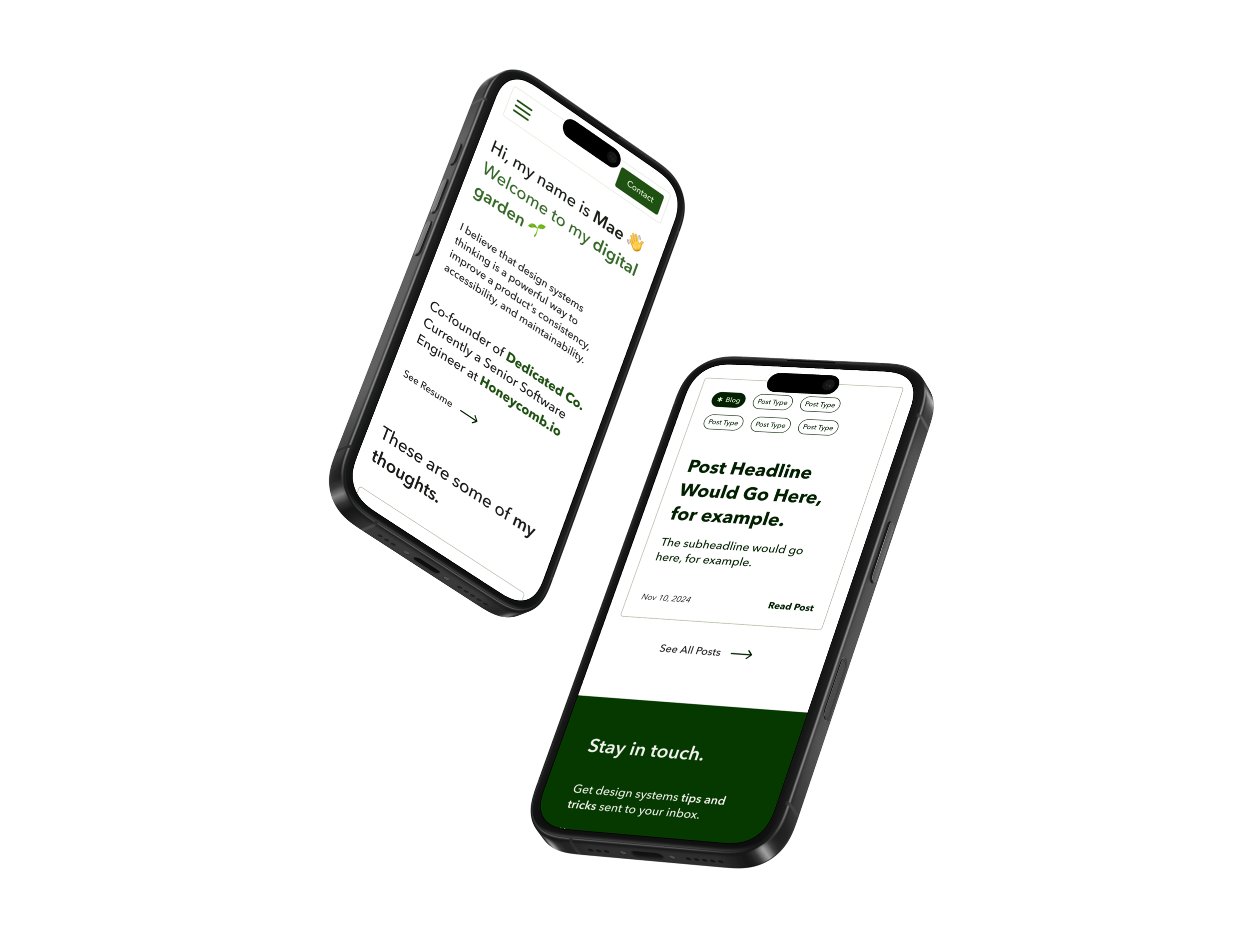
Throughout our discussions, our North Star was the concept of a “digital garden”—a site for Mae to plant and tend to ideas over time through experience and reevaluation. Although the designs are minimal, we wanted to allude to a garden in color scheme and component design.
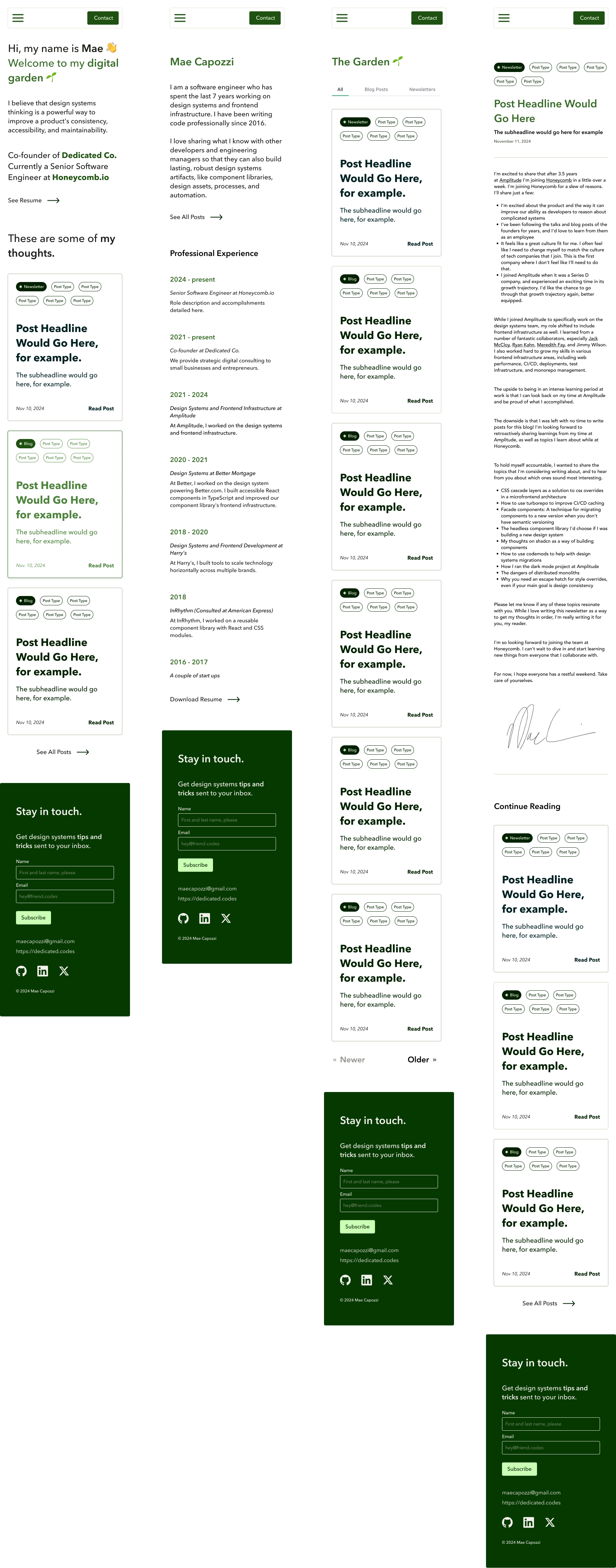
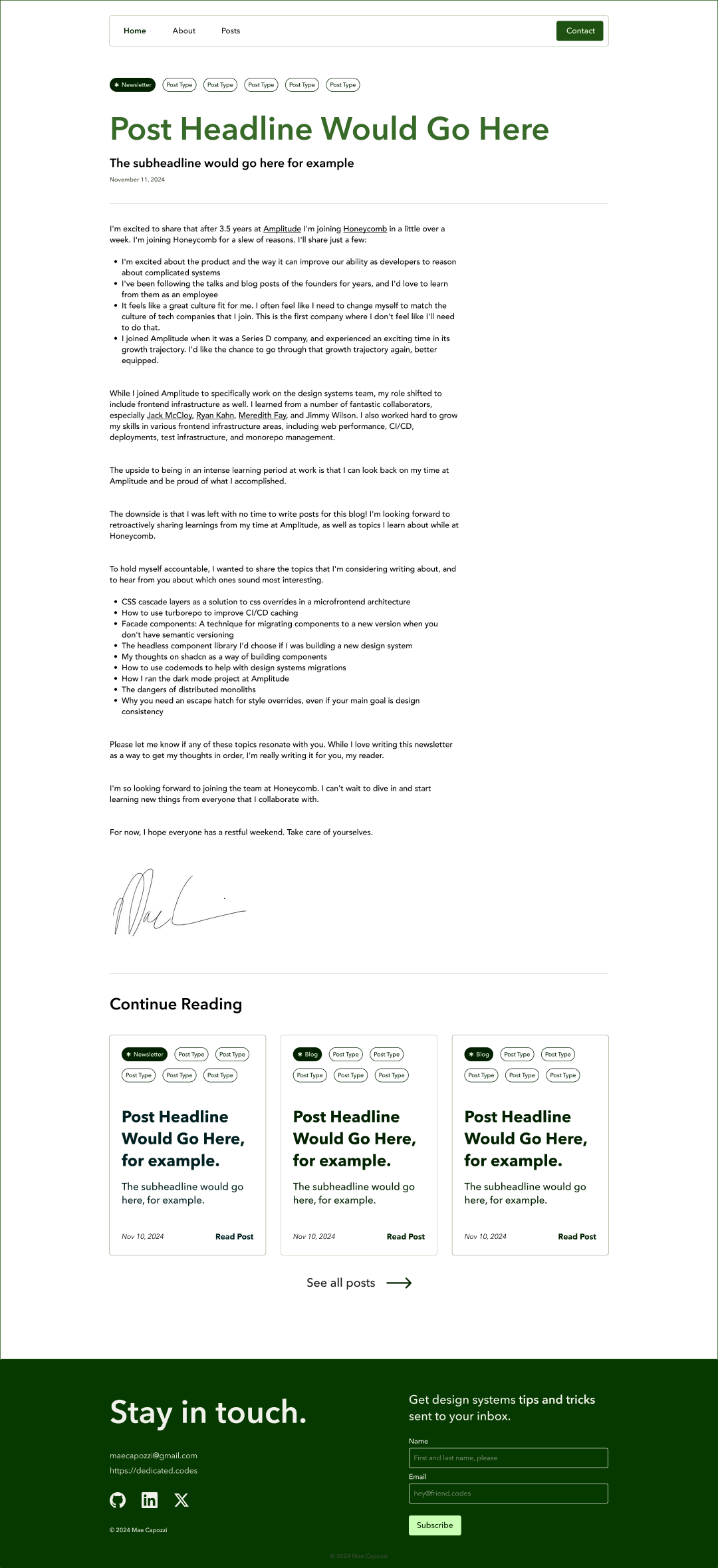
Functionally, the new blog design addressed all of the client and user goals we determined from our research. The top nav is no longer “floating”; there are CTAs throughout the site to unblock user journeys; conversational headers add the desired personable touch; posts are now linked in cards that provide additional context on the subject; tab navigation allows users to filter by post type, contact options, and a fleshed-out footer.
Secondary Buttons
Secondary CTAs throughout the hierarchy removed the dead-ends in navigation, creating opportunities for users to continue browsing.
Interaction States
Designing the interaction states made the site more dynamic and accessible to use. The new footer design encourages additional engagement (on and off site) as well as newsletter sign-up.
Bound Top Navigation
Wrapping the top navigation in a container distinguishes the core pages, making them easier to find when scanning the site. Here, I also added a light green box around the active page to help orient users as they browse.
Pagination
Pagination breaks up the blog’s hundreds of posts, keeping the most recent contributions at the front page.
Continued Engagement
Post suggestions keep users on the site engaging with Mae’s work.
“Garden Boxes”
My favorite elements of the redesign are the “garden box”card components. They create visual interest and provide users with additional context.
Utilitarian Footer
The new footer design encourages additional engagement (on and off site) as well as newsletter sign-up.
Scalable, Tabbed Sub-Navigation
A secondary tab navigation on the Posts page helps users browse blog posts, the newsletter archive, or all of the above. For scalability, it was kept sparse to allow for the future introduction of a keyword search, sort options, and tag filters.
Post Tags
In addition to post-type tags, subject matter tags provide users with context on the post before diving in.
desktop designs
IV. Debrief.
What did we learn? How can we improve?
key takeaways
Blog Features and Constraints
This project was an excellent opportunity to apply the skills I learned in DesignLab’s Advanced Figma Course. This included setting up design tokens, designing reusable components and variables, creating design documentation, and developer hand-off.
Collaborating with an experienced engineer like Mae was a masterclass in communication and cross-functional collaboration. I got to see the pros and cons of using AI tools like Cursor for frontend development. No spoilers, but sometimes speedier output comes at the cost of lower quality work overall. However, through continued feedback, collaboration, and iteration, we got to a finished product we can be proud of.
To read Mae’s take on this project, subscribe to her newsletter for the upcoming post!

non-profit website redesign
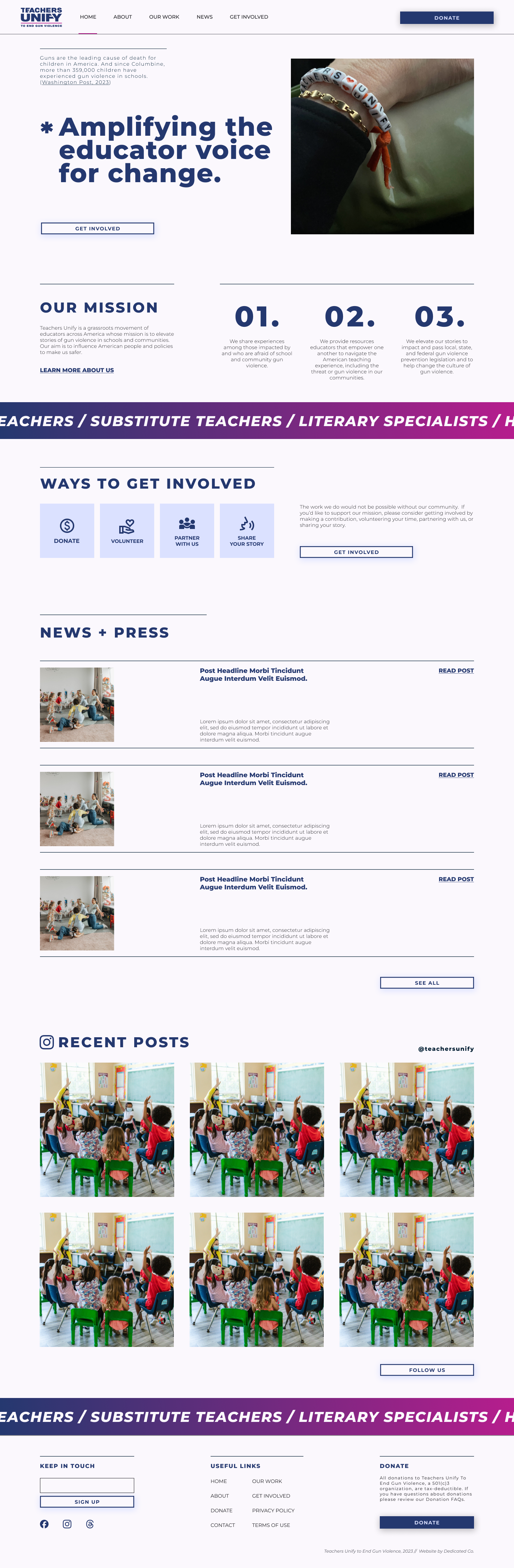
Teachers Unify Website
email marketing templates
Anyway Magazine