• non-profit website redesign
Teachers Unify
ABOUT
Teachers Unify to End Gun Violence is a nonprofit for educators, by educators. The website I designed for them accommodated their updated branding, fundraising efforts, new 501(c)(3) status, and resources for their constituents, resulting in a 178% yr/yr increase in user engagement.
ROLE
Lead Product Designer
TOOLS
Figma, ActBlue, LittleGreenLight, Canva, EveryAction
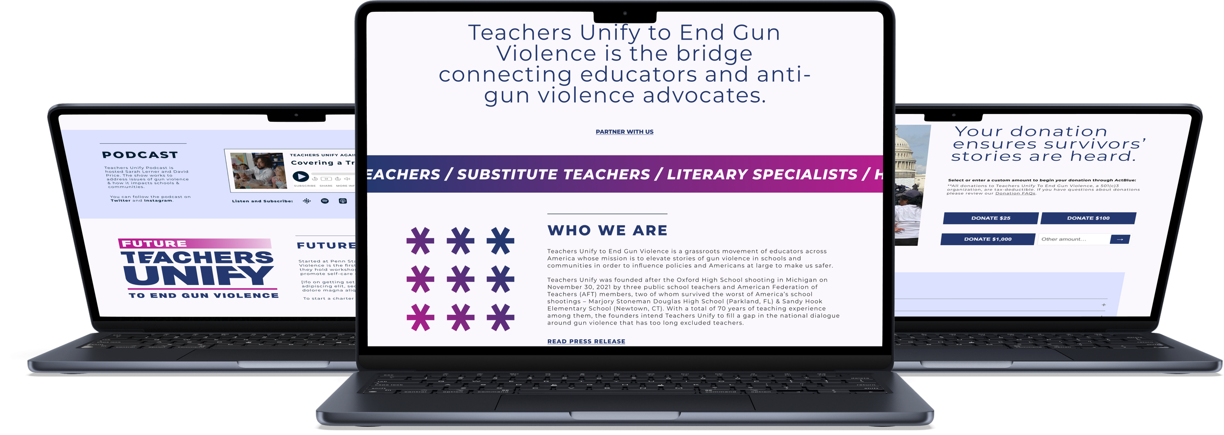
Table of Contents —
I. Discover.
What were we aiming to understand?
research plan
The Context
Teachers Unify is a grassroots organization that amplifies survivor stories to effect cultural and legislative change. I wanted to learn how to design a website that catered to both users from the community they serve and users looking to contribute funding in a way that was balanced and holistic.
Objectives
Establish the organization’s current state, user demographics, and immediate goals for the new website.
Determine how to best get users involved, whether that’s by making donations or partnering with the organization.
Discover the obstacles and technical constraints that might deter users from supporting the organization.
Methodologies
Comparative and competitive research to better understand the field and how other organizations’ websites serve their communities.
Client Intake Interviews to determine the business’ and users’ goals and needs, and where those converge or diverge.
Client Intake
In our kick-off meeting with Teachers Unify, we learned that most of their potential donors and partners learn about them via social media. We learned that their current internal processes are handled primarily by the co-founders—3 full-time educators—so the site has to keep those processes as streamlined and simple as possible. It needed to do so while also reflecting the growth the organization has experienced.
As they continue to grow, the website needs to host resources for the community they serve, present information for college groups who want to start on-campus chapters, recruit additional community involvement, continue collecting donations, and share news stories.
Competitor Research

Direct Competitors
Gun reform nonprofits fundraising and organizing to effect legislative change. Missions aim to serve a US-based population. For the examples, I’m looking at one that is smaller (Guns Down America) and one more popular large organization (Everytown for Gun Safety). Like Teacher’s Unify, their exact missions and methods are distinct. Both websites have some elements executed successfully and some that we should avoid.
Indirect Competitors
Large funding organizations who serve a broader mission and/or population. The examples I’m highlighting are the Jerome Foundation (funds early-career artists in NY and MN) and the Ford Foundation (has a broader mission to reduce poverty and injustice globally). Some patterns in their sites’ styles and architectures we should note for Teachers Unify’s website.
summary of findings
MISSION STATEMENT—Teachers Unify is a grassroots movement of educators across America whose mission is to elevate stories of gun violence in schools and communities.
The org’s mission should be presented directly and clearly on the homepage, elaborated on the About page, and summarized on the donation page.
How the org applies it must be elaborated on throughout the site.
METHOD—TU collects and shares experiences among survivors of school and community-involved shootings, as well as educators whose students are impacted by gun violence and the threat of gun violence in their communities.
Show rather than tell on the homepage. In other words, modules like “latest stories” and “impact”
Elaborated on in the about/work page (aka “what we do”)
IMPACT—We want to show users how their contributions will impact TU’s mission.
Should be paired with information on the mission to directly illustrate the org’s impact.
Impact blocks/modules are a good way to segue into our calls to action
THE WORK—The site itself hosts the components that make up the org’s mission (collecting and sharing testimony).
News & press to illustrate TU’s work out in the world.
Upcoming and past events
The podcast
THE TEAM—Show users whom is involved with helping the org achieve that impact
Who We Are overview, aka what brings the individual contributors at TU together.
Founders/Staff, Board Members, Advisors, Chapters, Survivors, etc.
DONATE—Should be easiest to find regardless of where you are in the user journey. Will live on the homepage, in the nav bar primary CTA, and the footer.
TU uses ActBlue to collect donations. Apply branding to an embeddable form on the site to reduce click points.
Important to include a Donations FAQ paired with an easy way to get in touch with questions.
GET INVOLVED—Answer the question “What does involvement look like?” This should be clear to the user, and the ways for them to opt in should be too.
We should have one page for all methods to get involved with TU, leading with donations.
The internal process TU currently has the bandwidth to maintain is a Google Survey for all involvement inquiries besides from donations (volunteering, sharing stories, partnering with the org).
II. Define.
How should we solve the problem?
personas
Donors & Volunteers—Grace
Objective: Looking for ways to get involved with Teachers Unify.
Description: Grace’s kid is starting middle school this year. She’s excited to see her child grow up but disheartened by all the gun violence in schools. The child of a former teacher herself, she has extra empathy for the school faculty and staff who are now expected to manage crises well beyond what they are resourced. Donating to an org that uplifts their voices and aims to reduce gun violence appeals to her.
School Faculty & Staff—Warren
Objective: Want to partner with Teacher’s Unify or contribute their voice/story.
Description: Warren’s school recently introduced heightened security and safety measures due to continued threats of gun violence. He’s always been vocal about the changes that need to happen to make schools and communities safe, and this experience has galvanized him to want to take on a more active role in gun violence prevention. He’s also hoping to prepare some resources to help emotionally support his students.

Survivors of Gun Violence—Kate
Objective: Want to contribute their stories and voices and stories.
Description: Kate is getting her B.A. in Education at a public university. Her school sadly experienced gun violence last semester, and she’s been dedicated to doing whatever she can to help to heal and prevent it from happening again. She’s looking for ways to share her story, advocate for herself and her future students, and to volunteer her time for this cause.
product roadmap
Features and Contraints
Keeping the budget and the fact that the website will be built on Squarespace in mind, what features do users need to ensure the product functions? What can I add to make the product more enjoyable?
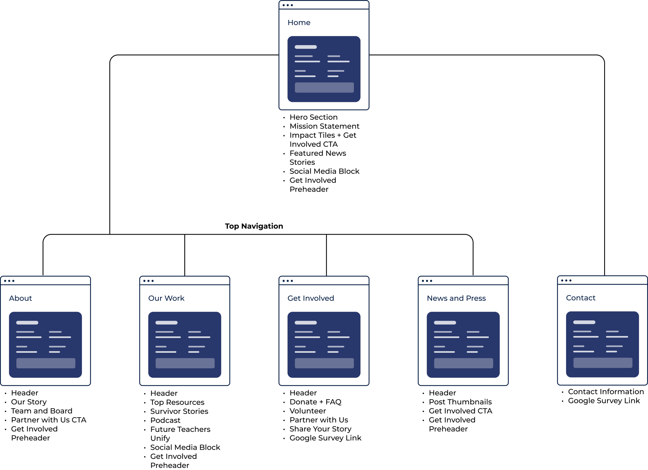
Priority Features
Top Navigation: Home, About Us, Our Work, Get Involved, News, Donate CTA
Home Page: Hero Section with Get Involved CTA, Mission Statement, Impact Block, News and Press, Socials
About Page: Organization story and press release, People Bios
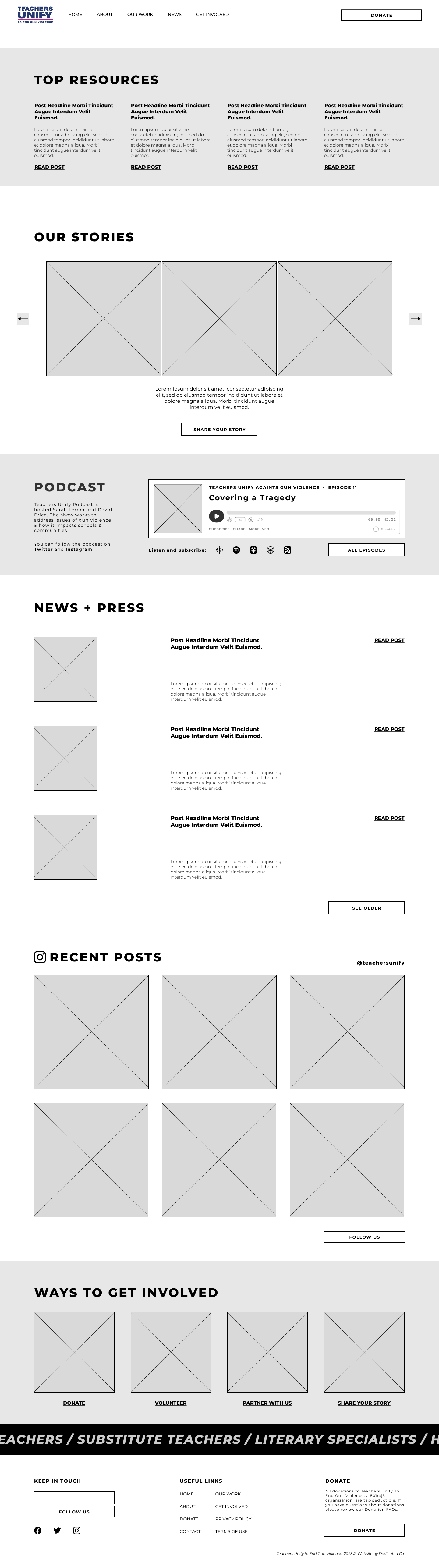
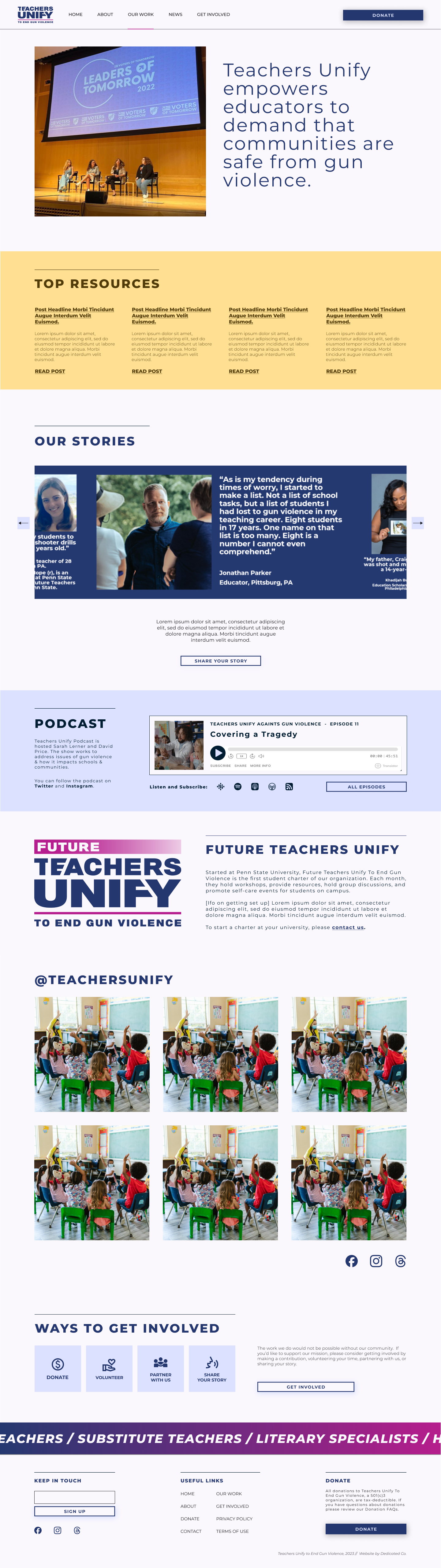
Our Work Page: Featured Resources, Survivor Stories, Podcast Block, Future Teachers Unify (Charters)
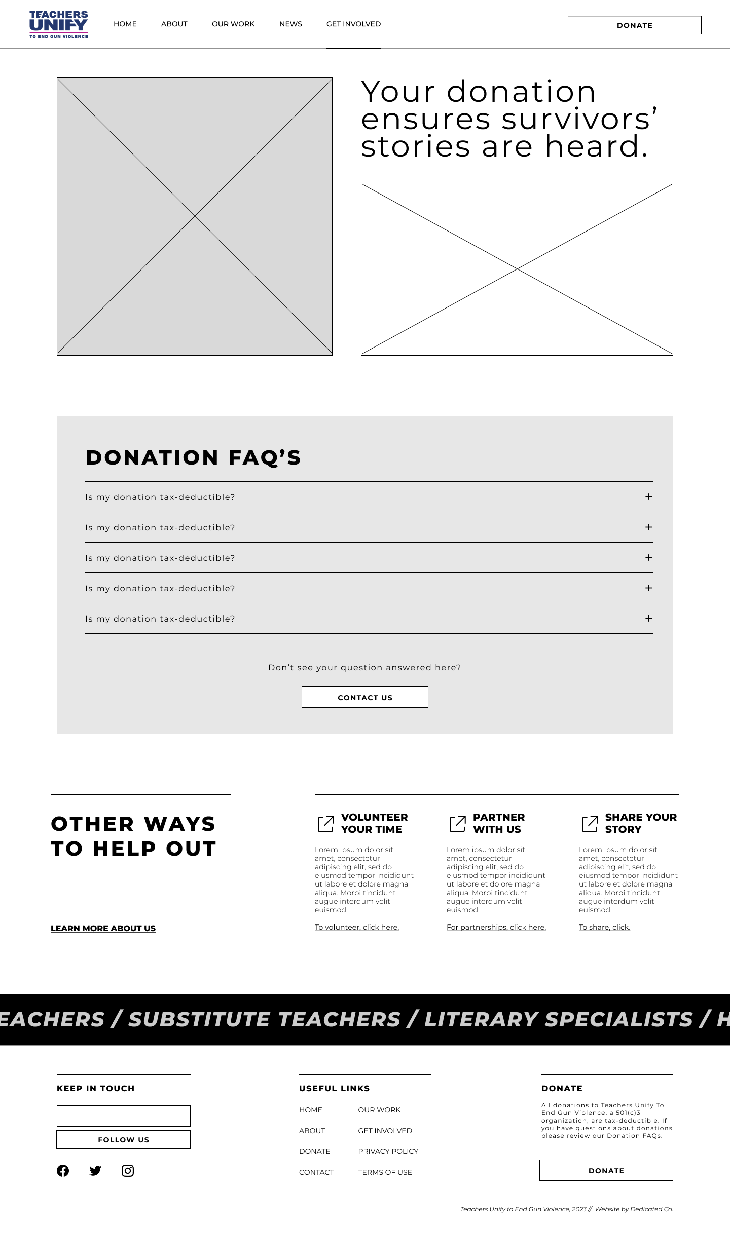
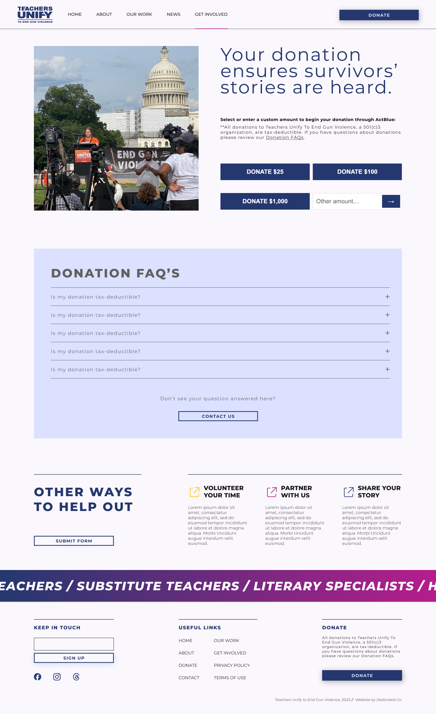
Get Involved Page: Donation CTA and widget, volunteer, partner, share, Google Survey link
News and Press: all news and press stories
Contact Page: Contact information, Google Survey link
Pre-footer: Ways to get involved block
Footer: Navigation items, newsletter sign-up, donation CTA.
Bonus Features
Events: calendar of upcoming events, gallery of photos and flyers from past events.
Updated Forms: ways to collect user info for volunteering, sharing stories, and partnering with Teachers Unify.
Who We Are Ticker: List of school professionals involved with Teachers Unify.
III. Design.
What should it look like and how should users interact with it?
brand & UI
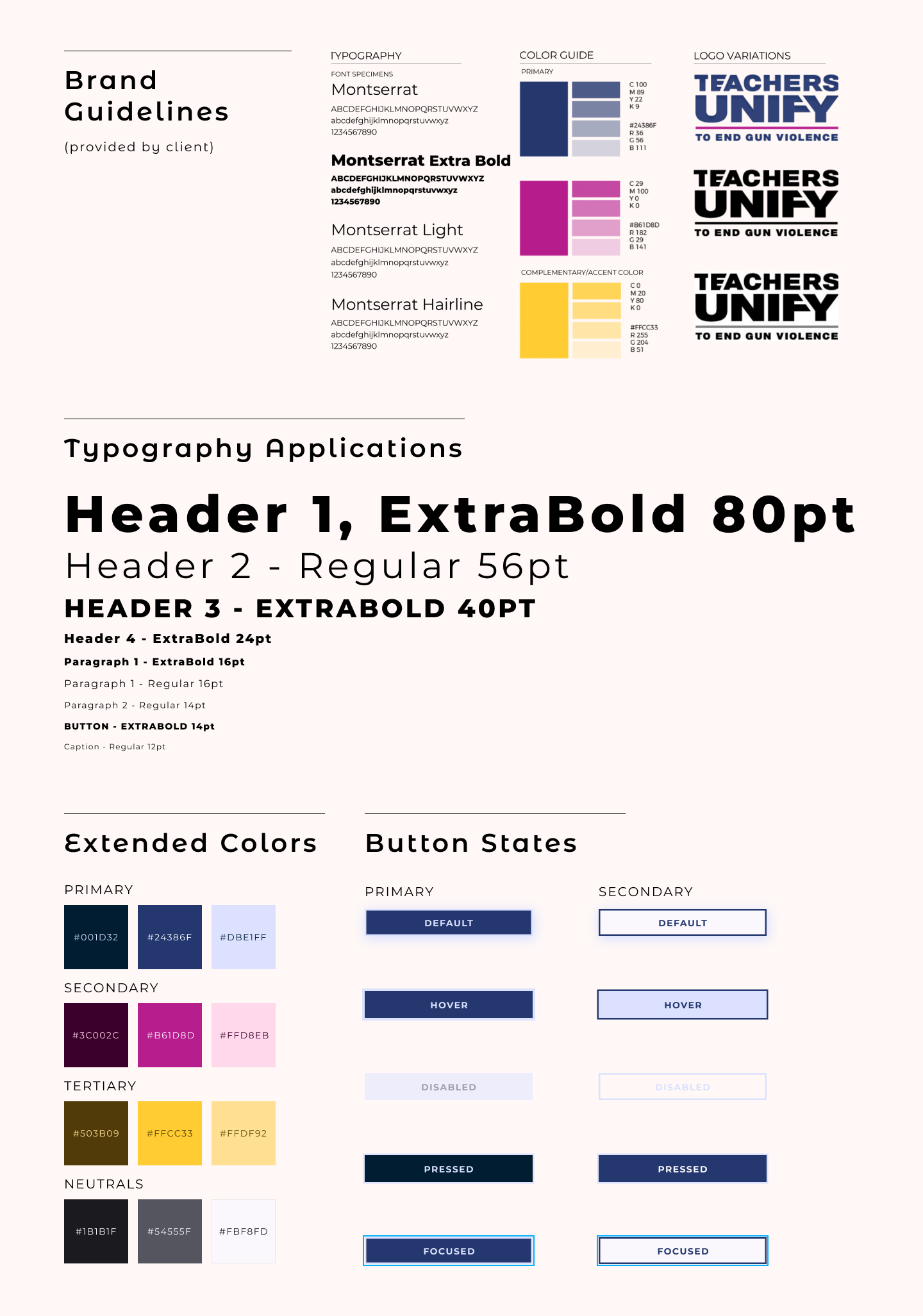
Expanding the Brand Guide and Designing UI Elements
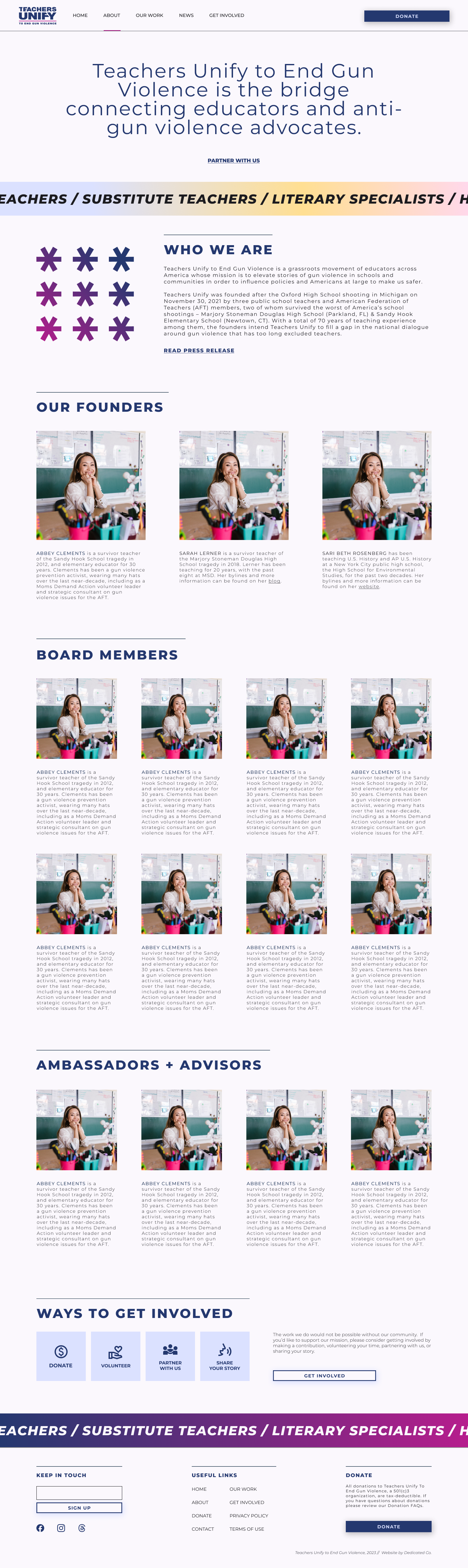
Teacher’s Unify came to us with the foundation of new branding, including an updated logo, new colors, and a brand typeface. To make sure the site was cohesive and had enough variety for visual interest, I expanded on the brand elements and designed the UI elements.
page designs
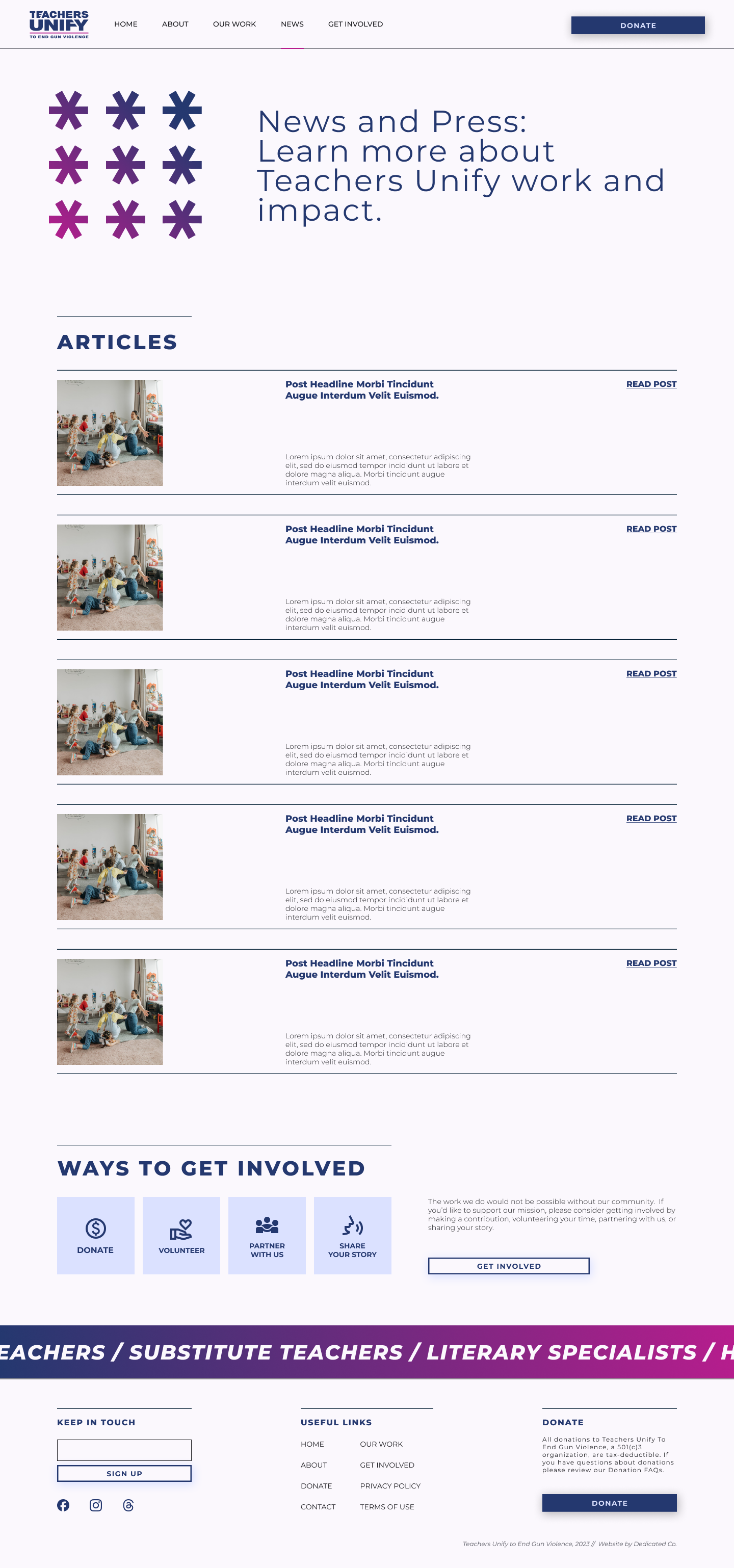
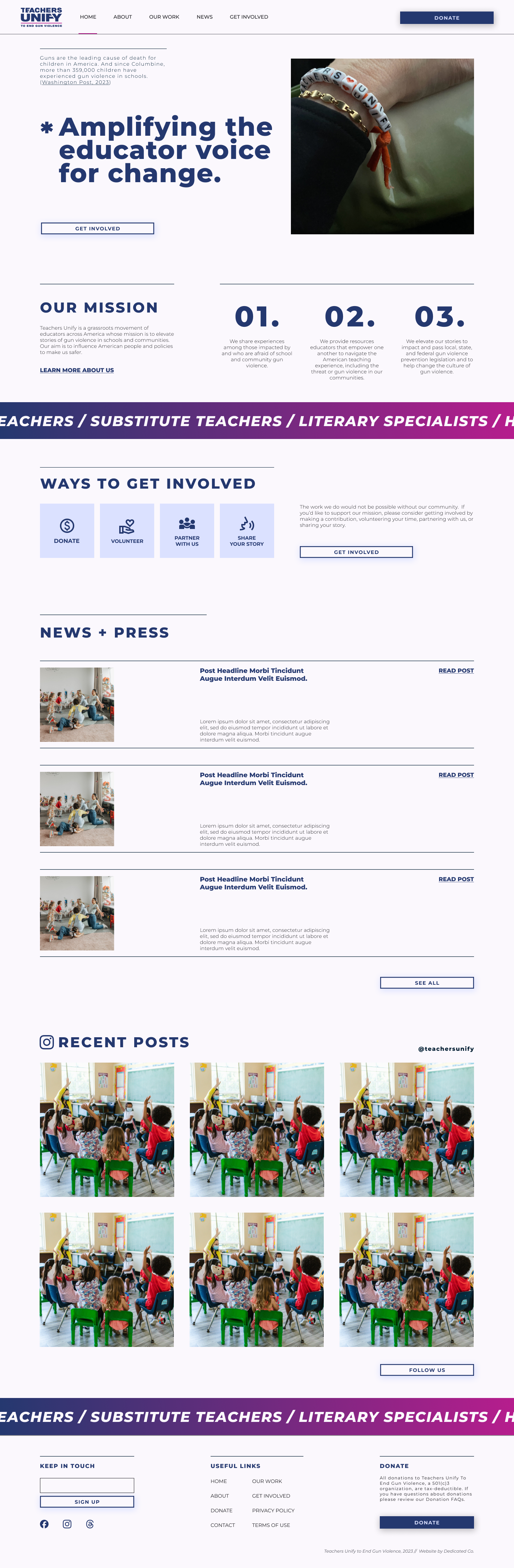
From Wireframes to High Fidelity Mocks
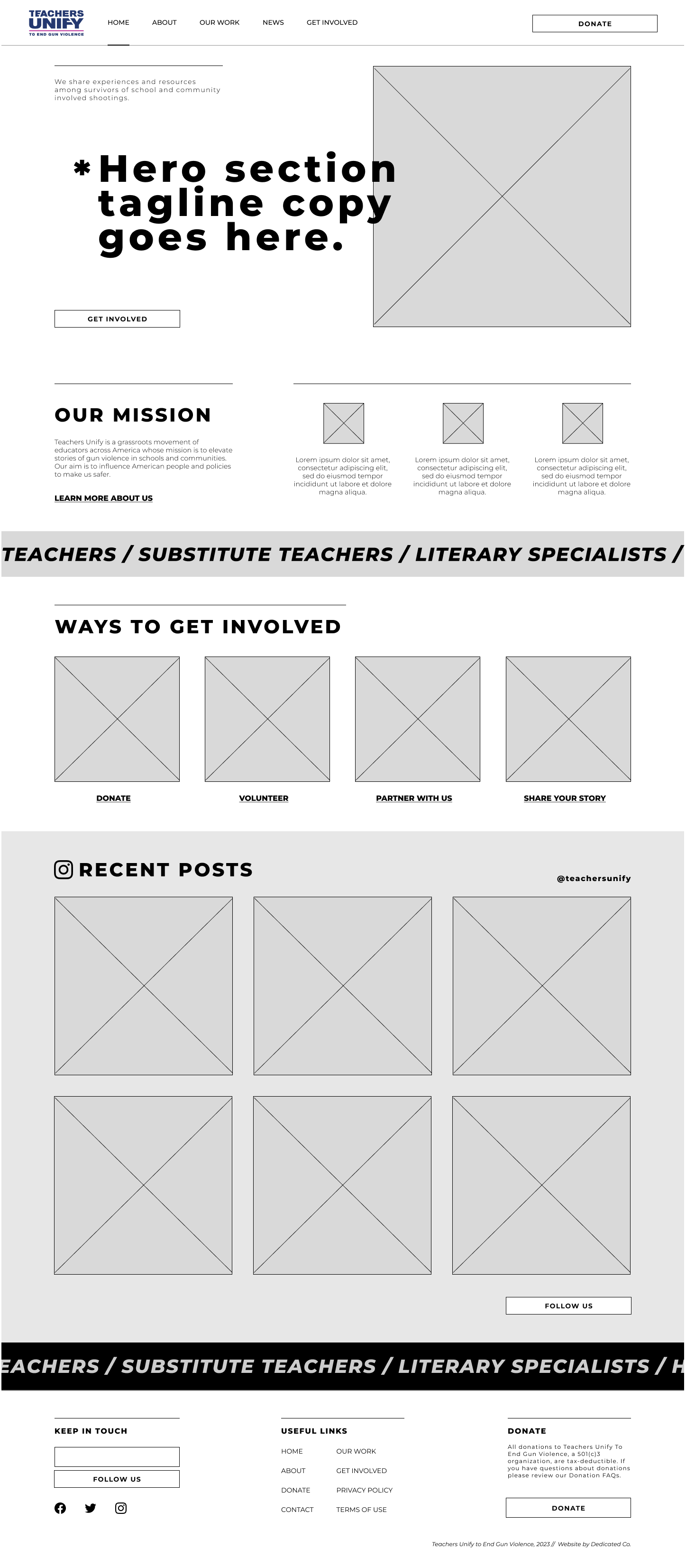
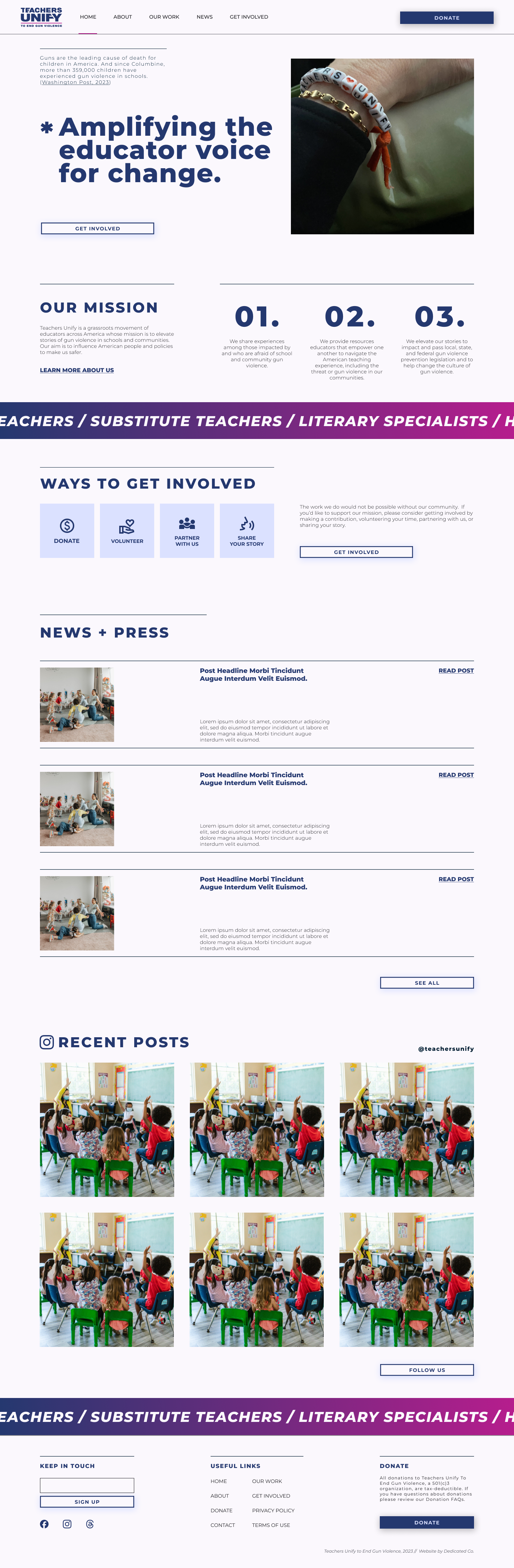
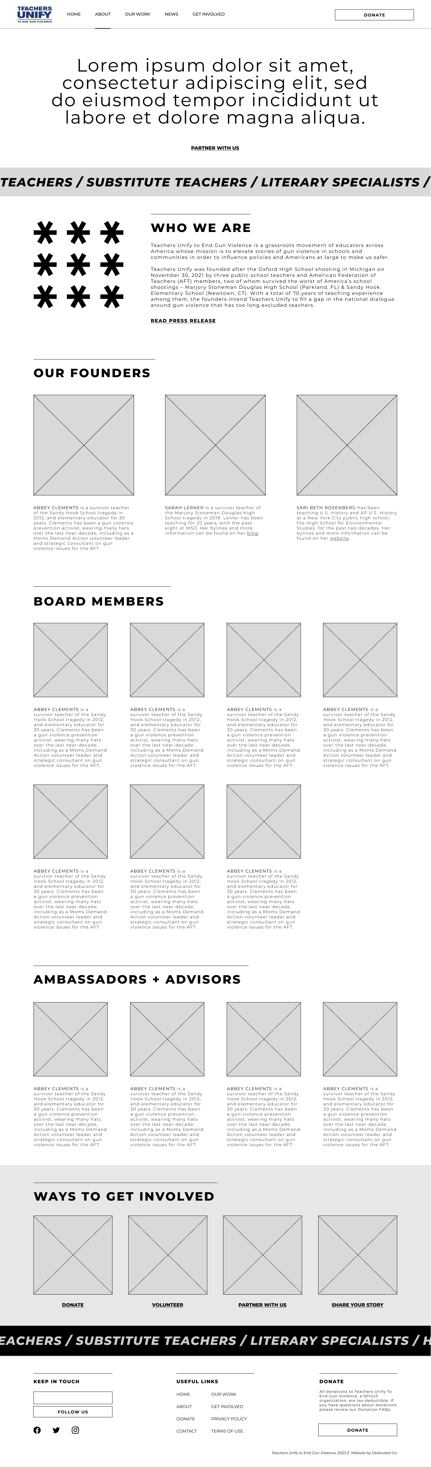
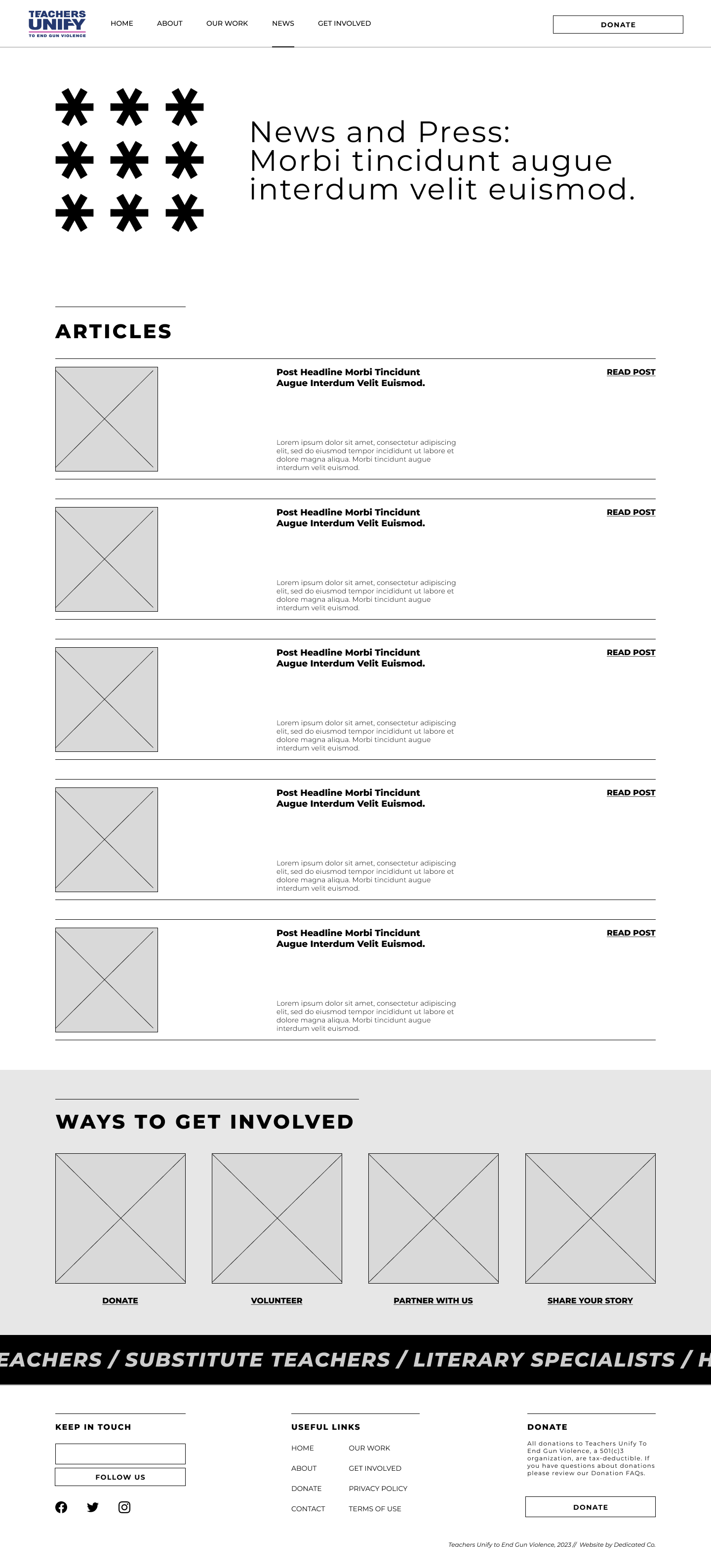
When working with clients, I like to do regular feedback check-ins during wireframe design and iteration. This helps ensure that the project and client goals remain aligned and on track. Additionally, involving the client in this process allows them to feel informed and empowered in the decision-making for the product they’ll have to operate once the project is complete. The wireframes below show where we started the iterative process with the client and where we ended before moving on to the site build.
Homepage
About
Our Work
News & Press
Get Involved
Contact
IV. Debrief.
Site build, next steps, and lessons learned.
site build
Designing for a CMS
As I was designing, I made sure to research and validate that my design decisions were achievable without too much custom work. I proposed a CMS because it would be more cost-effective and provide the client with more autonomy to conduct routine maintenance and content updates.
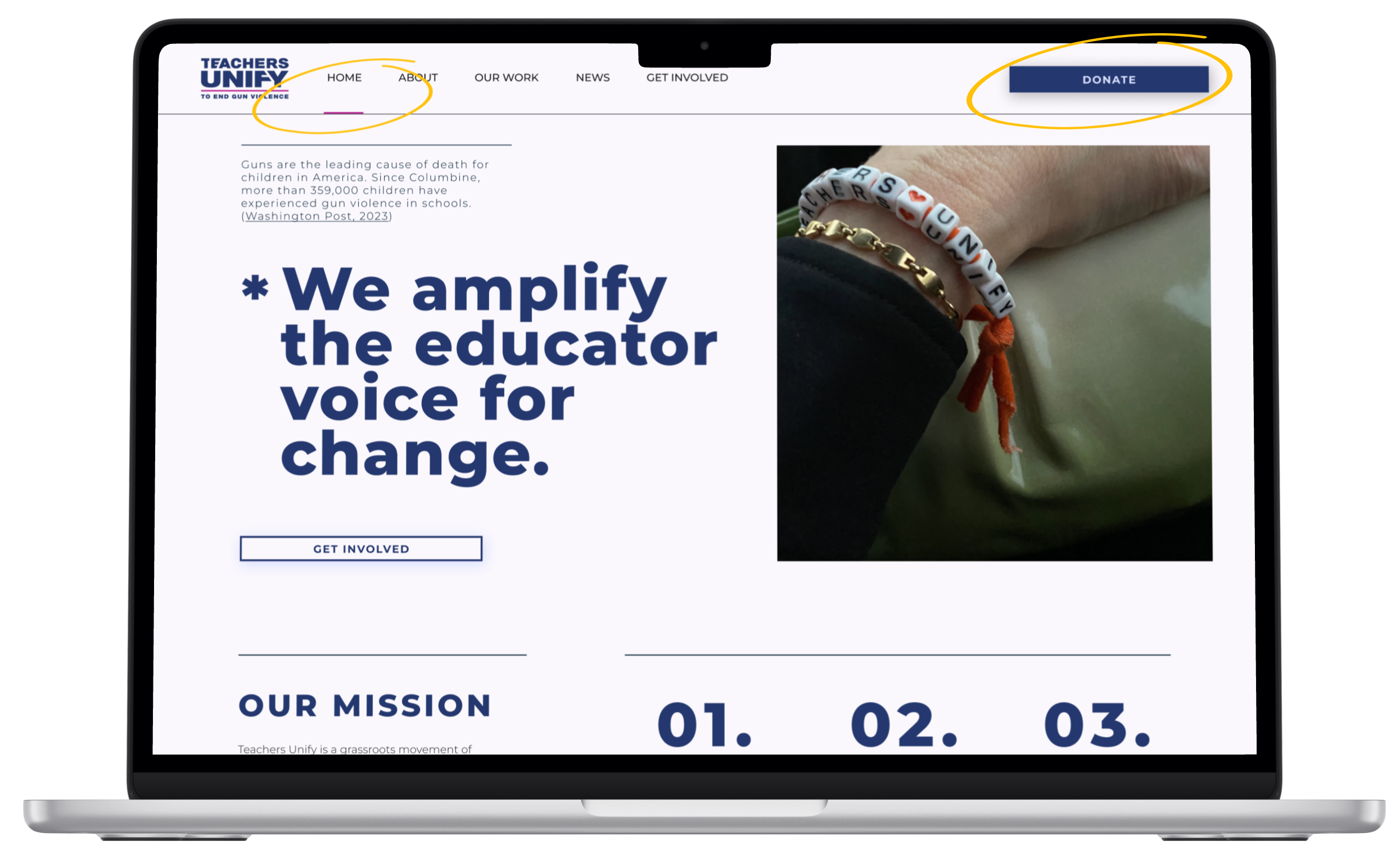
This project was the first I led from design through development. I got to hone my design skills on tight budget and practice implementing custom elements using CSS. These were the custom elements:
Top Nav Page Indicator Underline
Although this is feature Squarespace uses on their own site, it is not something that’s available through their design tools. This was a trying early lesson on containers and spacing in HTML.
Footer Form Field and Button Design
This is the custom feature that took me the longest. Similar to the Top Nav buttons design, Squarespace users don’t have much flexibility over form field and button designs. While the desktop and mobile views hold the intended design/sizes, in between screen sizes shift a little.
Custom Top Nav CTA Button
Squarespace provides flexibility in the Primary and Secondary buttons design, however, those settings didn’t apply to the Top Navigation button at that time.
Gradient Background Marquee Text
This was the most fun and satisfying of the custom CSS challenges I faced. Square does allow for slight changes to the text and spacing, but playing with color does require some tweaking. I’m very happy with how this element turned out.
future features
Room for Growth
Create new forms for the Get Involved flow, including Future Teachers Unify university chapters.
Design an Events Calendar to announce upcoming talks, volunteer opportunities, etc.
Impact page showing funding acquired and how that funding made an impact according to the org’s mission.
conclusion
The redesigned Teachers Unify website made it easy for people to donate and share their stories while keeping operations simple for the small team of educators running the show. By prioritizing clear navigation, accessible calls-to-action, and a trustworthy design that honored the organization's mission and new branding, the website created an intuitive user experience that resonated with donors, volunteers, and survivors alike. Post-launch, analytics revealed a 178% increase in form submissions, demonstrating that the site not only reflected Teachers Unify's growth as an organization but also actively facilitated it by making engagement easier and more compelling for a national audience.

more case studies.
non-profit website redesign
Teachers Unify Website
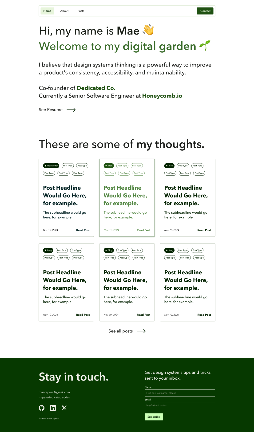
blog design
Mae Capozzi Digital Garden