Spring & Mulberry Mobile-First Redesign
A redesign of Spring & Mulberry’s key pages in the navigation and shopping flow led to a 273% increase in checkouts.
About the Client
Spring & Mulberry is a date-sweetened chocolate brand. Their website, hosted on Shopify, was initially designed for desktop. After receiving user feedback that the site was particularly difficult to use on mobile, they reached out for a mobile-first redesign.
For this case study, I will be focusing on the pages and features that had the most impact on the user journey: Product Card, PLP filter/sort, PDP, and Blog.
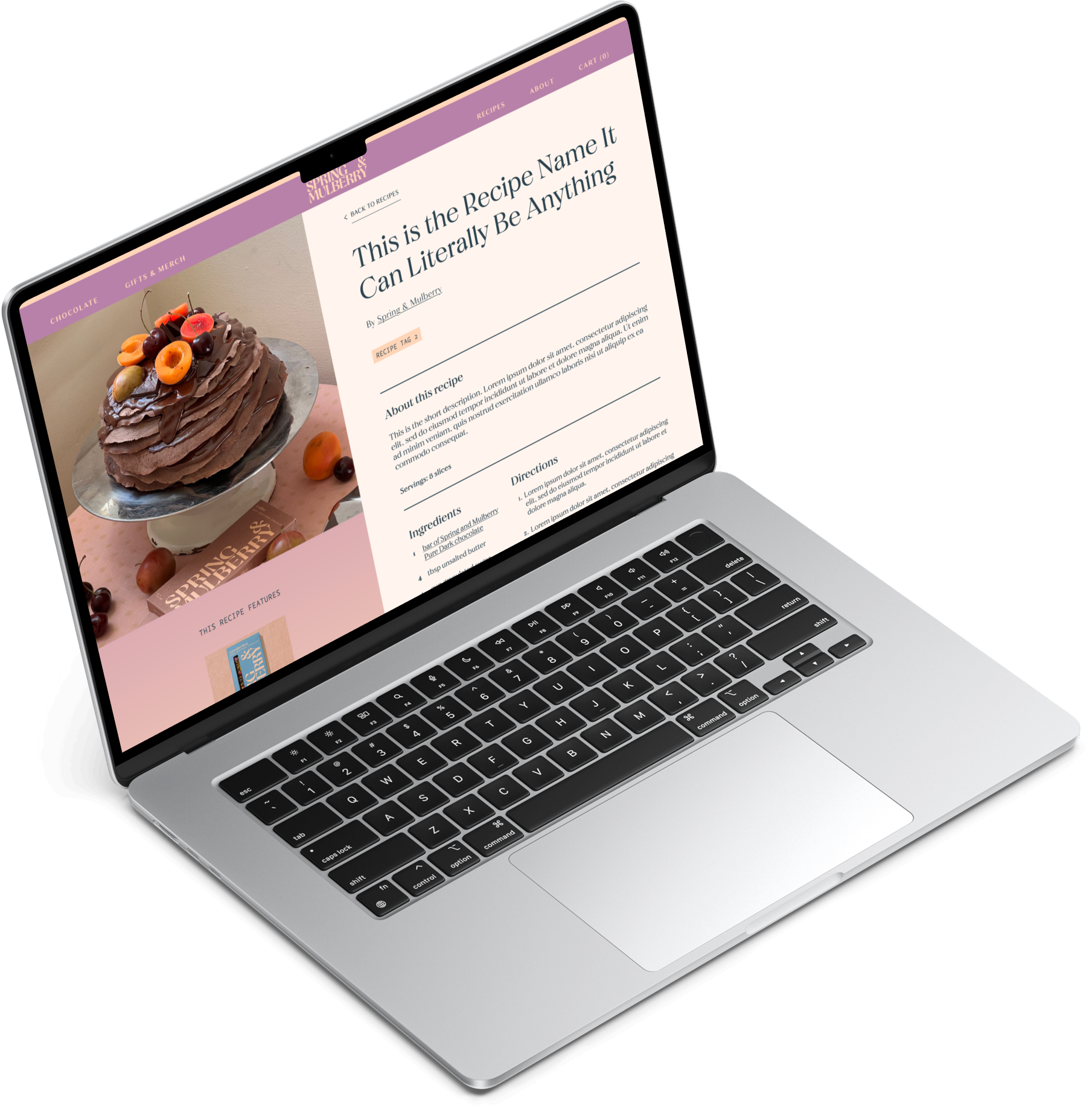
Table of Contents.
I. Discover & Define.
Intake & Client Brief
Usability Test Objectives
Summary of Findings
Project Parameters
II. Shop Flow.
Product Cards
PLP Filter/Sort
PDP
III. Blog.
Market Research
Blog Parameters
UI Design
Sales Leads


Want to skip ahead?
I. Discover & Define:
What was I aiming to understand?
I wanted to identify what parts of the Shopping Flows users were experiencing the most friction and how to optimize updates to stay within the project scope and budget.
In order to better understand the organization, the market, and the user, I prepared a Research and Usability Testing Plan.
What was my Research Goal?
Test the “add to cart” flows on the existing website to identify user pain points and improve usability.
What Research Methodologies did I use?
Comparative and competitive research with client provided samples that aligned with the goals they have for the website.
Client Intake Interviews to determine the business’ and users’ goals and needs, and where those converge or diverge.
Unmoderated field study, using Maze.co. The benefits of this method include:
Observe how users act in their usual environments
Test a larger number of participants
Quicker turnaround on sourcing and gaining insights from participants
Keep testing costs low


II. Shop Flow:
What design improvements will reduce friction?
Improve the Add to Cart flow by strategically updating information architecture, typography, and UI components so that they are more accessible and intuitive for users.
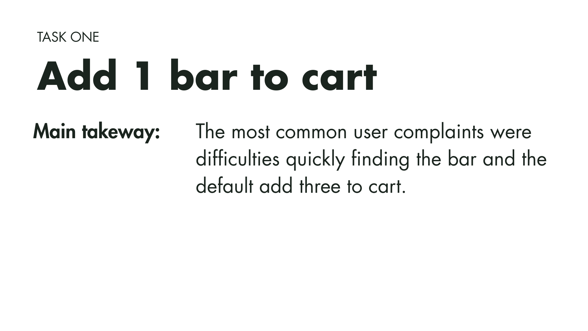
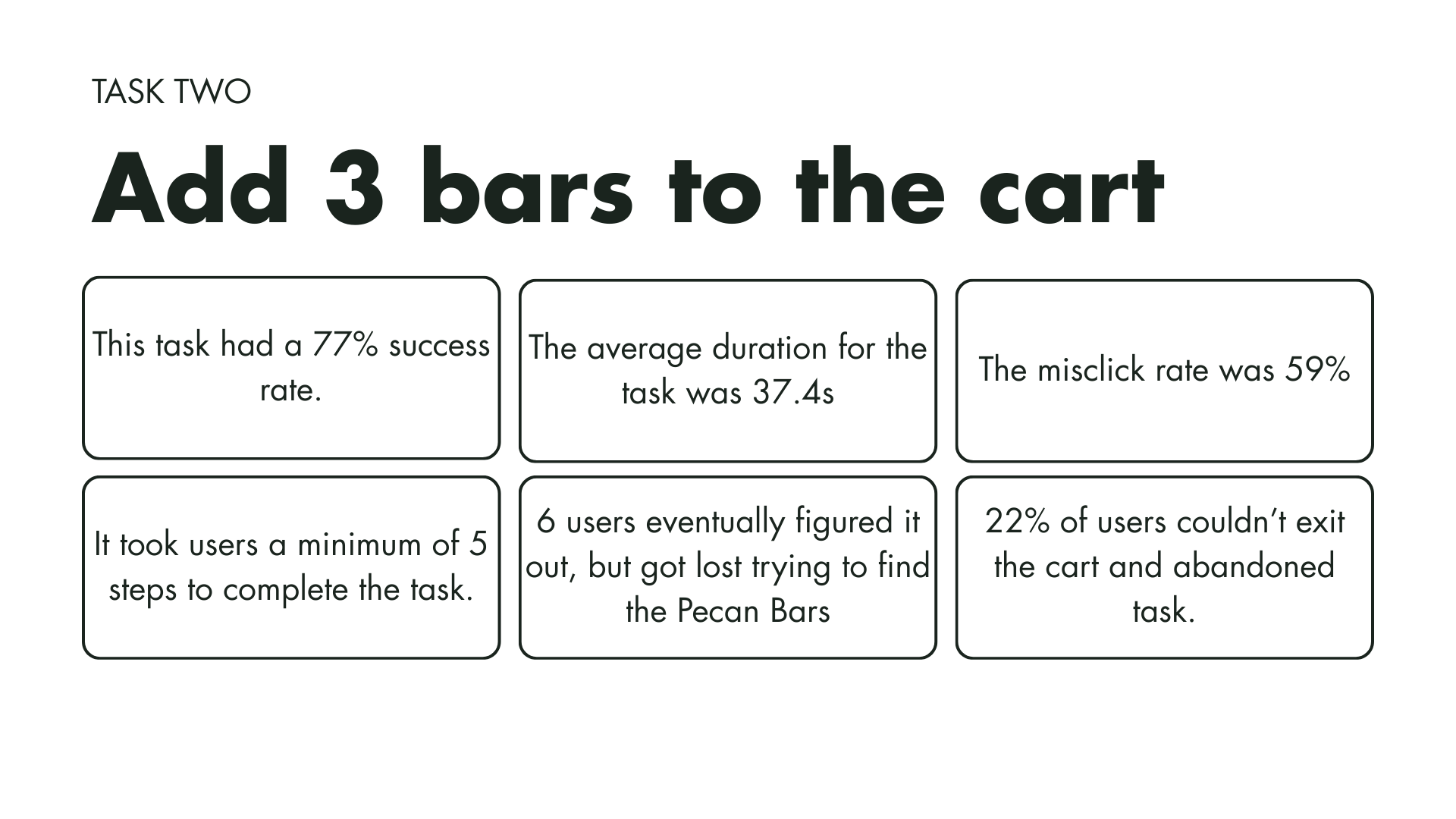
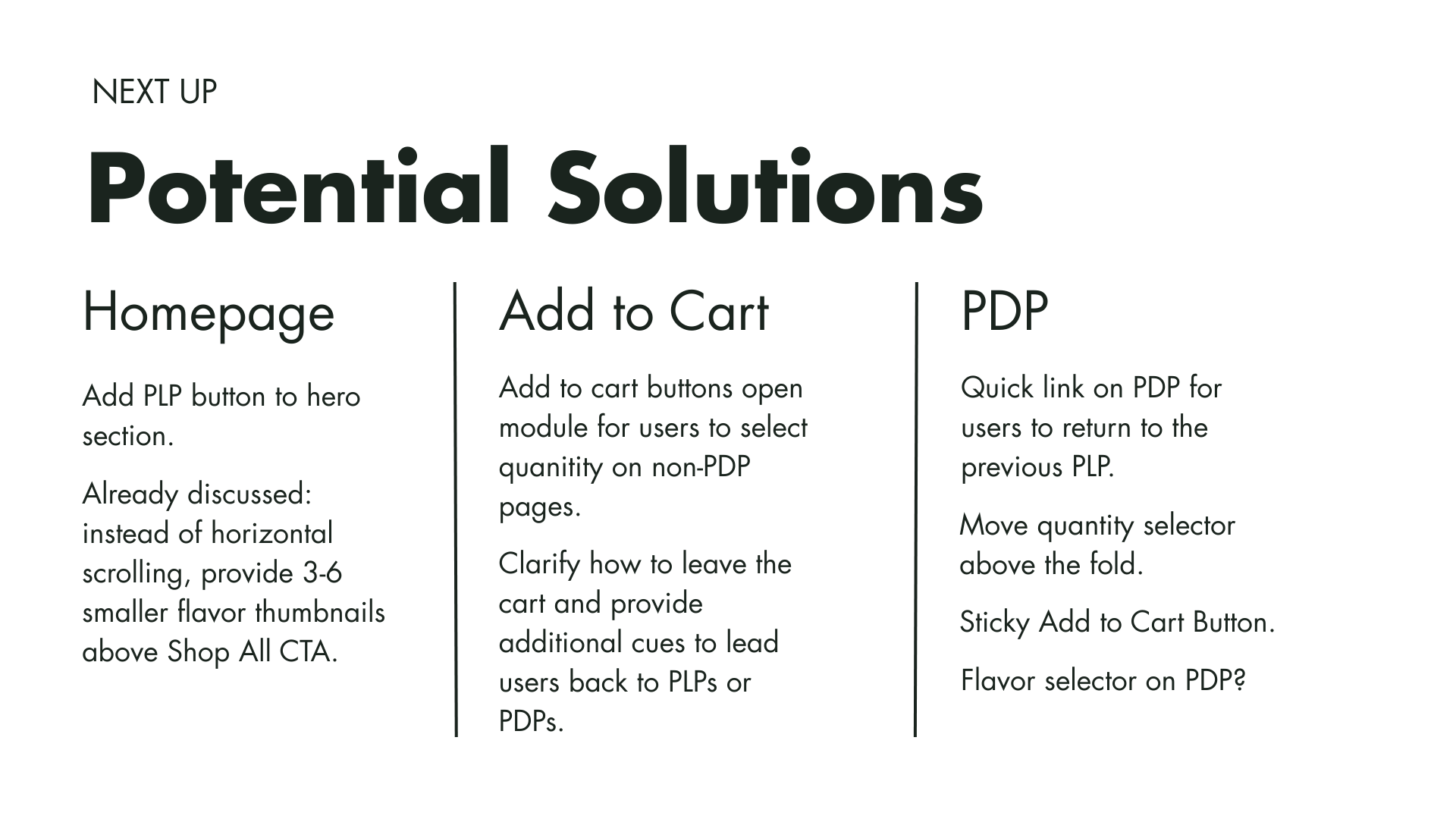
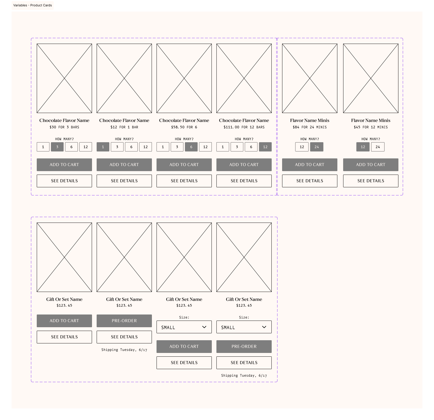
Adding Flexibility to the Product Cards
The primary frustration users reported was adding the desired quantity of units to the shopping cart. Previously, the Quick “Add to Cart” button only allowed users to add 3 bars at a time. This meant that if users wanted to change that amount, they had to add or subtract in the shopping cart. That decision was made by the business because they wanted to upsell to reach sales goals; however, the rigidity was actually deterring users from completing their purchases. By adding a quantity selector to the product card, we provided more flexibility in the Add-to-Cart flow. By leaving the default option 3 bars, we incentivize users to save the more they buy.
Reorienting the PLP
When the site was first designed, the decision was made to design for desktop. Many of the elements on the site, both visual and interactive, were therefore horizontally oriented.
In our usability testing, users reported that the single-column PLP felt like an endless scroll and that they had difficulty finding the item they were looking for.
On mobile, features like filtering on the PLP meant users had to side scroll in order to see all the options, which made browsing products difficult for some users. This feature, in particular, also did not resemble any design patterns associated with e-commerce sites. Lastly, while the PLP on desktop allowed for multiple columns, on mobile, there was only a single column of product cards.
I designed a recognizable filter drop-down and a 2-column PLP to solve those issues.

Balancing Brand and Functionality on the PDP
Although the PDP had more flexibility in the add-to-cart flow, users still complained that those features were difficult to use due to their size and placement. Additionally, shop functions and editorial copy were mixed, making certain features difficult to find.
By reworking the page’s hierarchy and resizing interactive elements, we improved clarity and usability. The extended detail copy was moved below all shopping interactions in the hierarchy. Also, features like a sticky add-to-cart button and navigational buttons provided additional ease for users.

III. Blog:
Marrying educational content with sales opportunities.
Design pattern research, sketches, and wireframes helped me determine how users will interact with the site to carry out tasks.
Competitor Research Findings
Generally, the elements on the competitor blogs felt crowded, although in some cases, that’s likely to complement their maximalist branding. Spring and Mulberry’s more spacious brand approach will allow for a more spacious blog design.
A blog post listing page with an endless scroll and no filtering options adds frustration for users. Especially as the number of posts increases, it leads to slow loading and is not mindful of evolving business goals. Pagination, even in the early phases, will prevent issues in the future.
On the recipe pages, it is important to balance sales leads with smooth usability. Too many product placements on the page get in the way of its intended use (following a recipe), and not enough is a missed sales opportunity.
Standardized image treatments create a more cohesive feel on the blog posts listing page. Because Spring & Mulberry is sourcing their blog content and images from recipes contributed by collaborators on Instagram, overcrowding and superfluous elements should be avoided.


Want to skip ahead?
Blog Parameters
The timeline and budget were major concerns for the blog. They wanted to launch at the beginning of their holiday marketing cycle, and scope creep from previous project stages ate into the budget. Keeping this in mind, I wanted to make sure I was able to design something users would find useful and easy to navigate, while staying consistent with their brand and aligning with business goals.
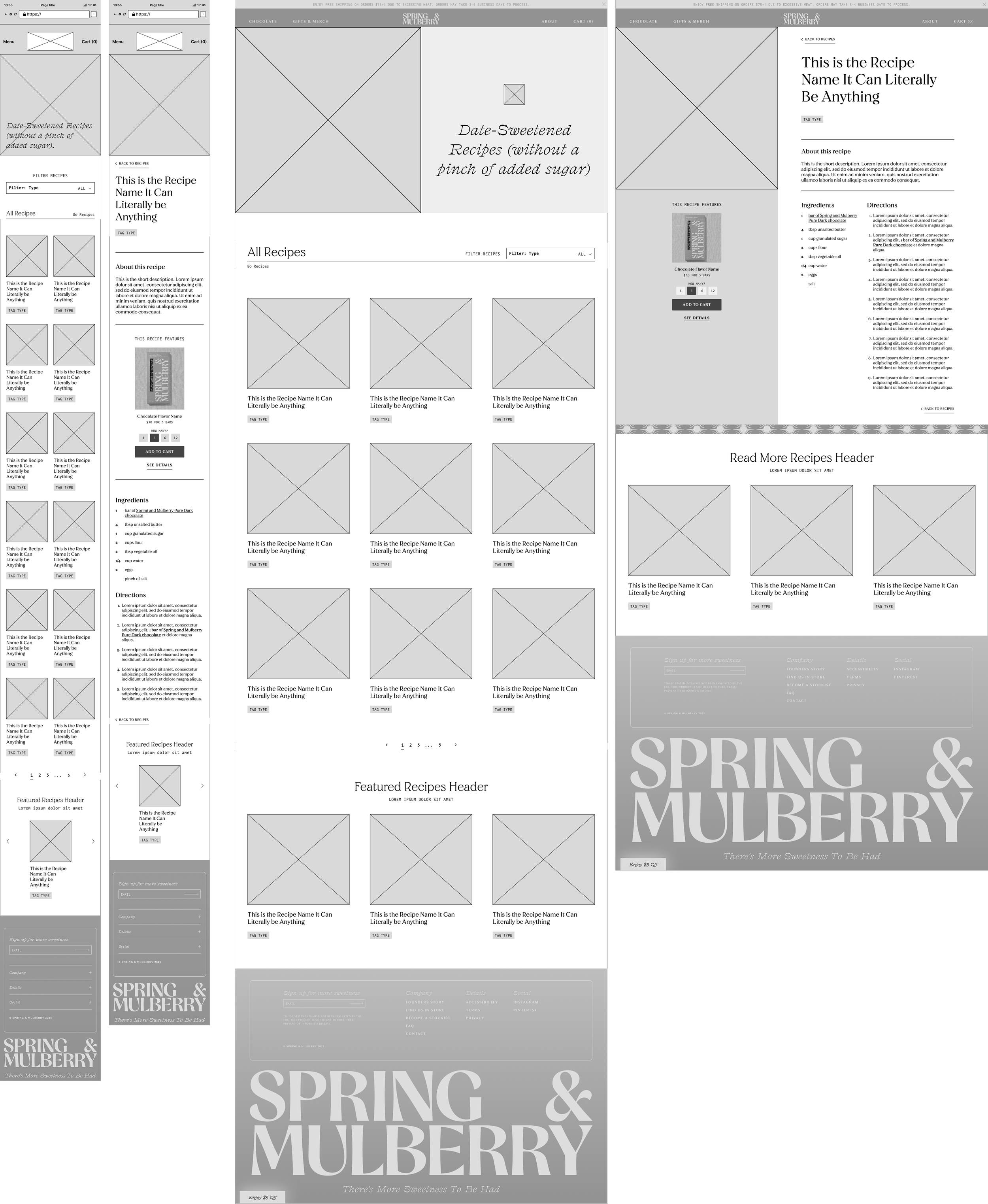
Blog Listing Page
MUST HAVES
Header Image: With text overlay: Date-Sweetened Recipes (without a pinch of added sugar).
Filter Drop-down: Keeping design the same as the PLP to reduce scope.
Recipe Cards:image, title link/button, tag.
Pagination: reduces load times and is easier to navigate back to (for example, from a product PDP or recipe page).
NICE TO HAVES
Featured Recipe: Header for the blog post listing page.
Frequently Used Products Upsell: additional user entry point to Shop Flow.
Instagram Plug: good way to keep users who aren’t already following in the loop when new recipes are published.
MAYBE SOMEDAY
Email Subscription: email collection form for sending featured recipes to users as part of the e-marketing strategy.
Search Bar: assists users’ browsing.
Recipe Page
MUST HAVES
Back to recipes: ease navigation
Header Image: 1:1 to reduce editing from Instagram.
Intro: Recipe name, byline (if applicable), tag, title, short description, and number of servings.
Featured Product Card: “This recipe features:”
Recipe: Ingredients & directions, products’ PDPs linked where mentioned.
Continue Reading: Recipe recommendations to keep users on the site browsing.
NICE TO HAVES
Intro: Time to cook (including prep time).
Social Share: passive way to improve SEO.
Prefooter Upsell: could include things like variety packs or seasonal featured products here.
MAYBE SOMEDAY
Recipe Toolbar: metric conversion toggle, “now cooking” to keep screen active, serving size multiplier, grocery list export.
Nutritional info: As SM is in the health food niche, this info could add value.
Designing a blog with room to grow…
Spring & Mulberry’s branding is minimalist and spacious with delicate flourishes, so the blog design should reflect that. They plan to collaborate with food influencers on blog posts to direct potential customers to the recipe pages and, therefore, to their products. Because the influencer content will likely vary in style and treatments, sufficient white space between recipe cards will allow them to shine, even within a multi-column grid on the listings page. Further, features like pagination, bylines, and links/buttons to featured products on the blog give the blog the flexibility to grow as more posts are published and business goals evolve.
Wireframes:
Blog Post Listings Page

(Un)Filtered page header: confirms to users that the selected filter type loaded.
When you filter for “breakfast” in the dropdown, for example, the header will say “breakfast recipes” instead of “all” and the number of recipes will update.
Recipe Cards: simple with enough flexibility for different-length recipe titles or adding more tags, if introduced.
3x3 Grid: About 10 posts per page is the best practice from a user experience and SEO perspective.
Recipe Blog Post Page

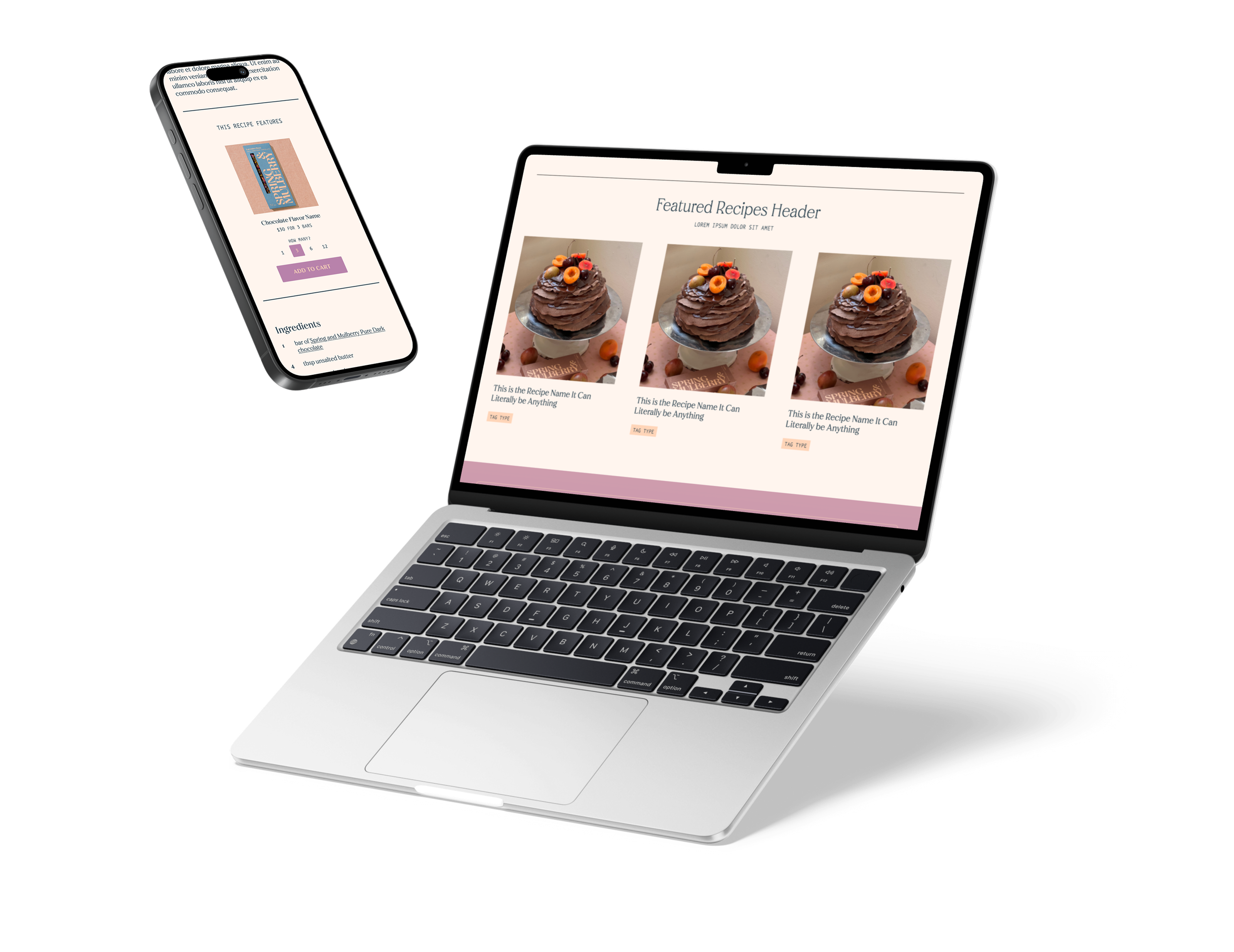
Benefits of moving the featured product card into a separate column on desktop:
Having it in its own section allows it to stand out without disrupting the flow of the recipe content.
Putting it below the recipe image and next to the ingredients list can help users associate the featured product with those elements.
There’s room to include more than 1 featured ingredient without disturbing the recipe layout, if a recipe calls for it.
The gradient background emphasizes the card and creates some visual interest, even when a recipe does not include a featured product card.
Directions: ingredients will include their amounts in the instructions, as pictured (see #2). This will reduce the amount users need to scroll up and down when using the recipe on mobile—especially important when your hands are covered in food!
Proposed next steps to improve Spring & Mulberry
Add social share links to reach potential users/customers and improve SEO
Update the Blog Listing Page Header to include a featured recipe. This way, they can highlight recipes featuring their seasonal products, promotions, etc.
Add a module to their marketing emails directing users to the recipe blog.
In Conclusion…
Spring & Mulberry’s site had several UX issues, such as unclear hierarchy, inconsistent interactions, and accessibility problems. These created friction for their core customer demographic (40+). After auditing the site and validating findings through competitive research, usability testing, and performance analysis, I identified two major blockers in the add-to-cart flow that were driving high bounce rates: 1) users could only add three bars at a time, and 2) small font sizes and interactive elements (24px or less) made altering the amount in the cart challenging for users. I introduced a quantity selector and improved typographic accessibility sitewide, which reduced friction and contributed to a 273% increase in checkout completions.